Revlo fit
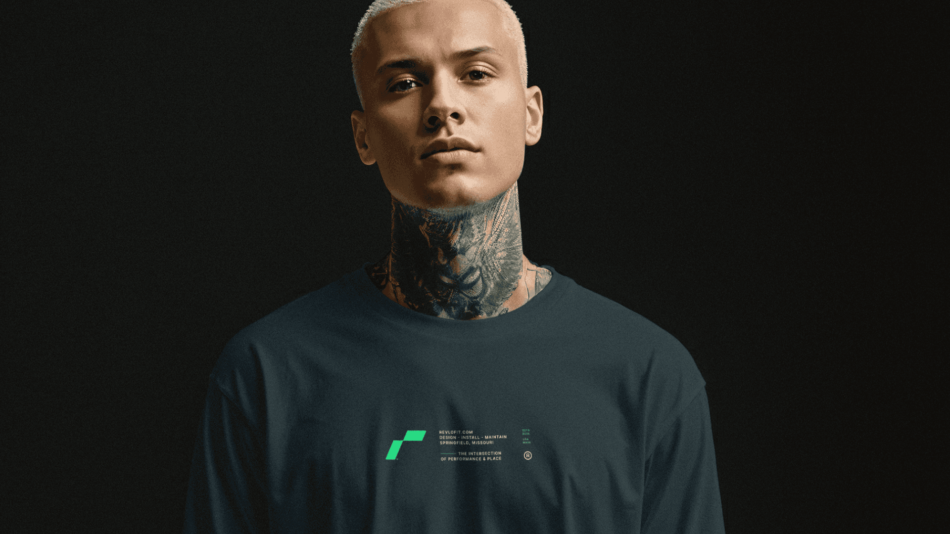
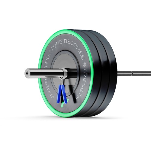
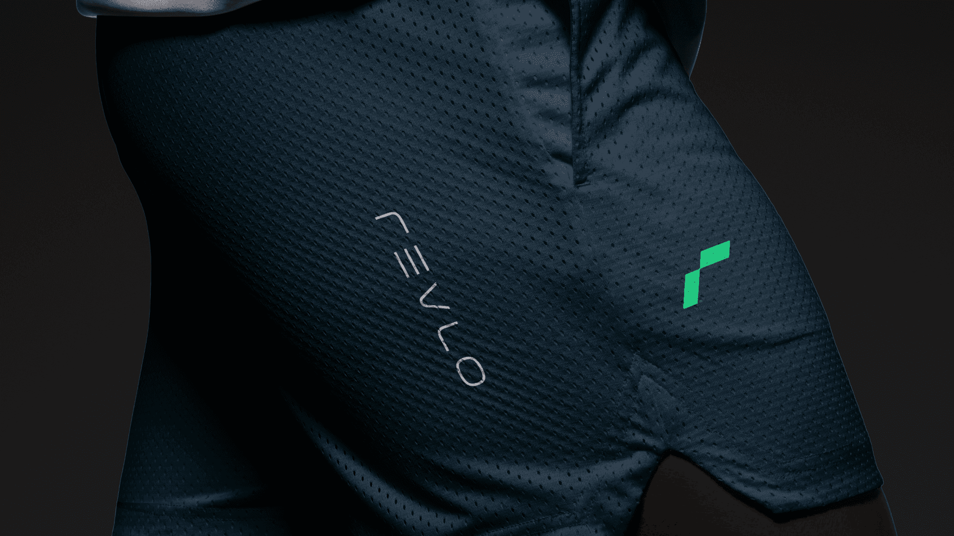
Revlo Fit brings intention to motion—transforming how people train, recover, and live. Built around the belief that structure creates strength, Revlo crafts fitness environments and programs that balance precision with purpose. Designed for athletes and everyday movers alike, the brand redefines performance through clarity, discipline, and design—proving that progress isn’t accidental, it’s engineered.
Project Brief
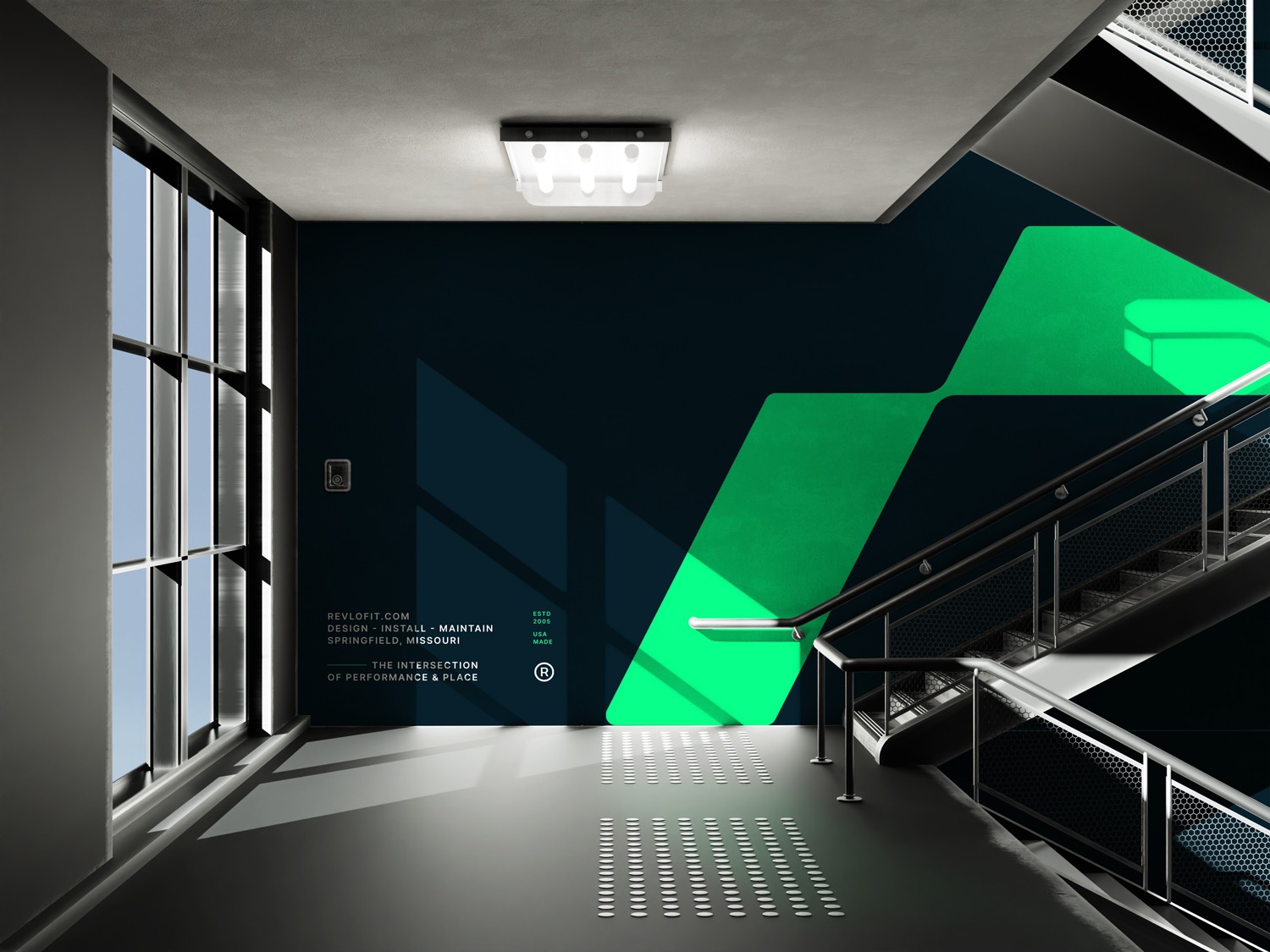
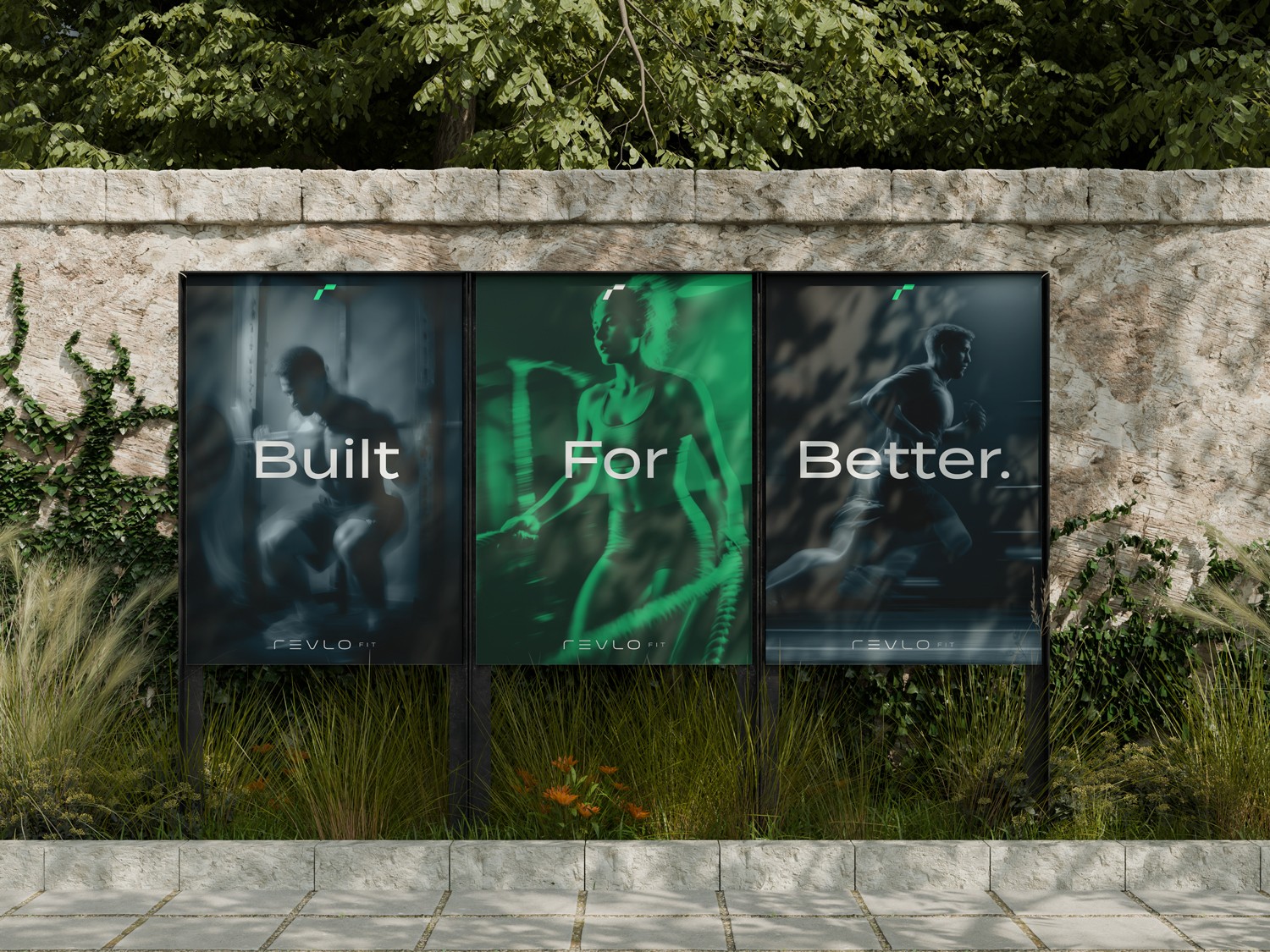
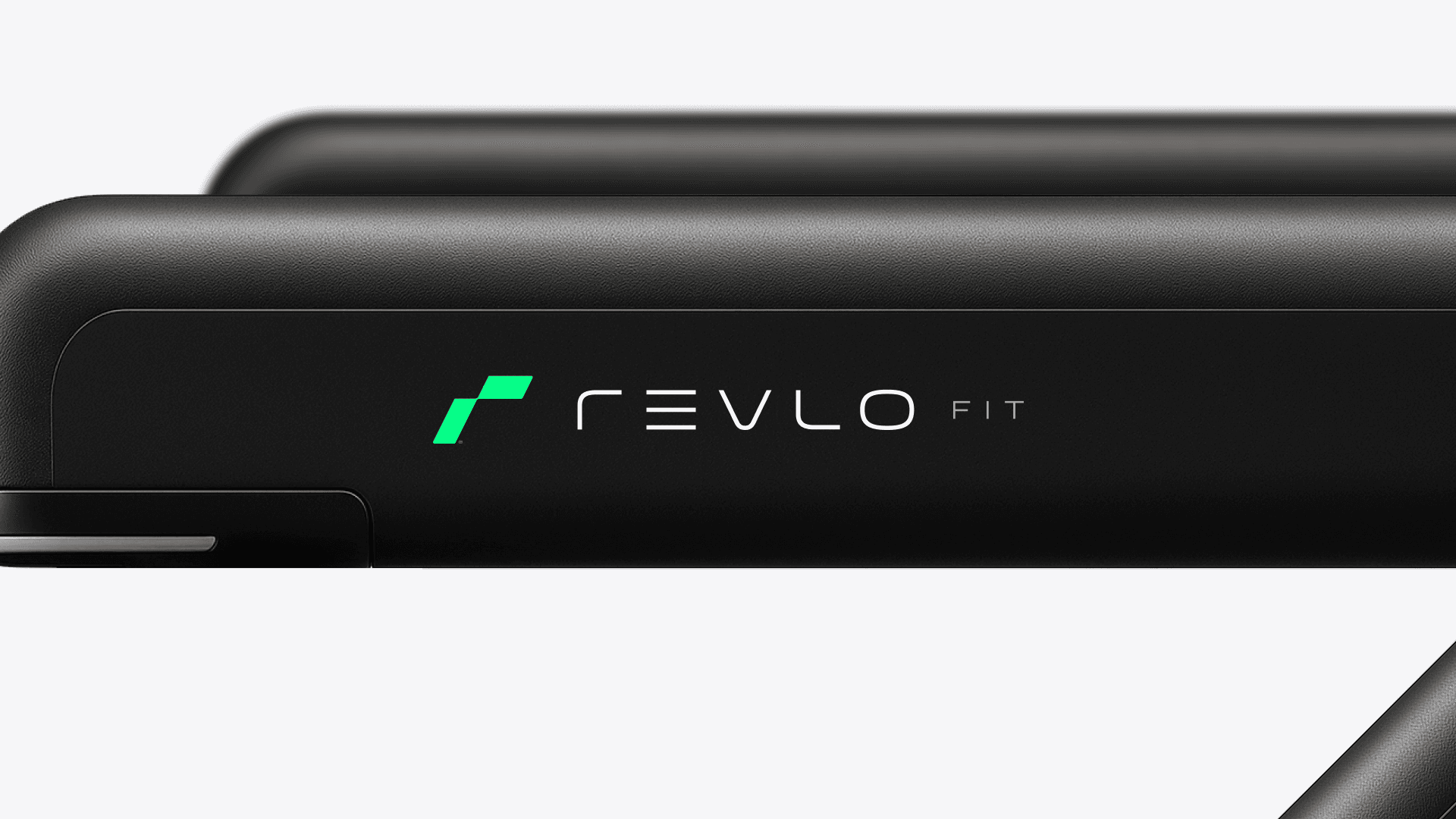
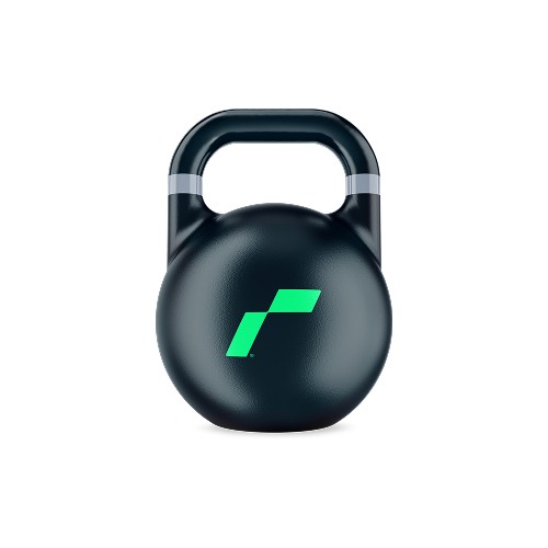
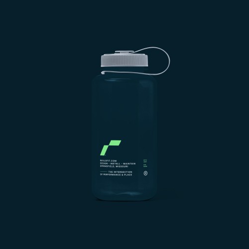
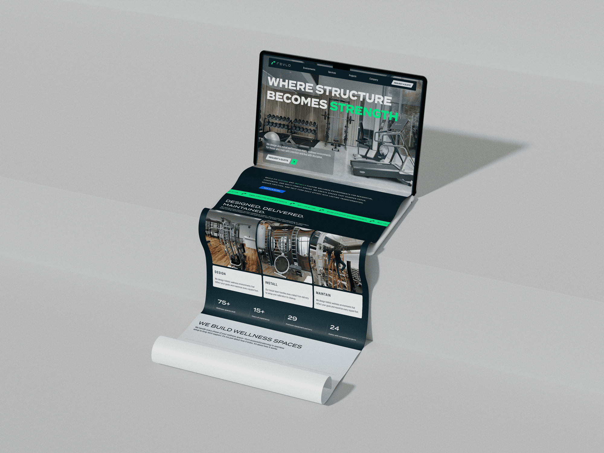
We teamed up with Revlo Fit to bring definition and depth to every layer of their brand. From foundational messaging and naming structure to bold visual systems and a performance-driven website, Hook shaped a brand built on clarity, discipline, and design. Our integrated verbal and visual identity translates Revlo’s philosophy—structure creates strength—into every detail, uniting confident typography, purposeful motion, and grounded tone into one unmistakably Revlo experience.
Deep Teal
Pantone 2217 C
#061F2A
Stone
Pantone 427 C
#DBE2E9
Concrete
Pantone 7543 C
#9CA9B9
Revlo Green
Pantone 7479 C
#06FF89
Electric Blue
Pantone 300 C
#0061FE
Pure White
#FFFFFF
Closing thoughts
Our collaboration with Revlo Fit shaped more than a fitness brand—it built a foundation for focus, balance, and lasting progress.
By blending disciplined design with grounded storytelling, we created an identity that mirrors Revlo’s philosophy: structure creates strength. The result is a brand that feels precise yet approachable—one that unites visual clarity, confident motion, and purposeful tone across every touchpoint. Together, we defined a system that moves with intention and stands as strong as the people it’s built to inspire.