Alitus
Alitus brings clarity to complexity—guiding individuals and families toward smarter financial decisions and stronger futures. Built on the belief that wealth should be intentional, not accidental, Alitus delivers strategic financial planning rooted in discipline, trust, and long-term vision. By aligning every decision with purpose, they help clients move forward with confidence—proving that true financial freedom is designed, not discovered.
CLIENT
Alitus
Year
2025
Services
Website
Project Brief
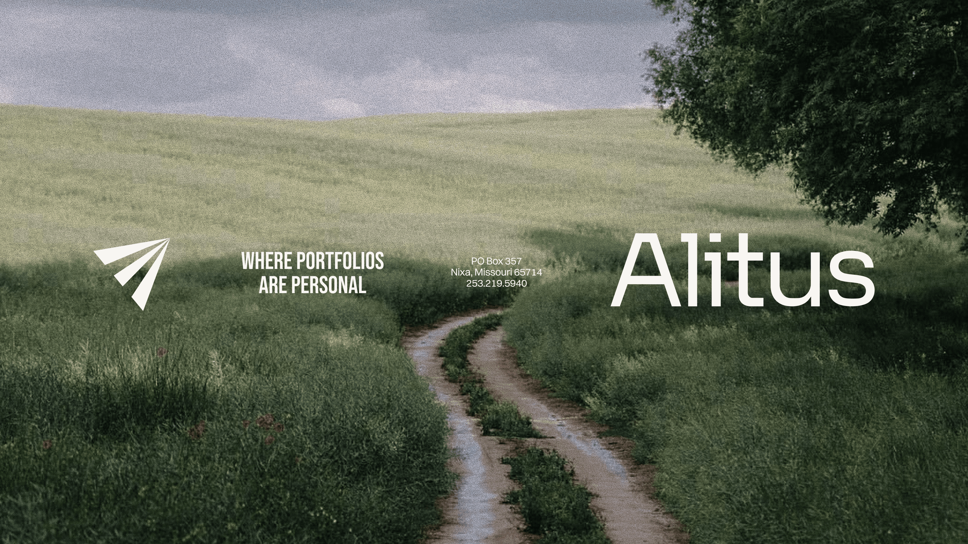
We partnered with Alitus to bring structure and sophistication to their brand—aligning every touchpoint with the level of clarity and confidence they deliver to clients every day. From refining their messaging and positioning to crafting a cohesive visual identity and digital experience, Hook built a brand system designed to simplify the complex and elevate the conversation around financial planning.
The result is a unified identity that reflects Alitus’ core philosophy—intentional guidance, grounded strategy, and lasting impact—brought to life through confident typography, clean design, and messaging that speaks with precision and authority.

White
Pantone 2217 C
#F4F4F4
Alitus Green
Pantone 427 C
#ACB69E
Alitus Blue
Pantone 7543 C
#A6BDD4
Carbon Black
Pantone 7479 C
#252523
Warm Grey
Pantone 300 C
#9C9892
Cream
#D5D0C6


Closing thoughts
Our work with Alitus shaped more than a financial brand—it created a framework for clarity, confidence, and long-term trust.
By combining strategic messaging with a refined visual system, we built an identity that reflects the way Alitus serves its clients: with intention, discipline, and care. The result is a brand that feels both elevated and approachable—one that simplifies complexity, communicates with confidence, and stands as a trusted guide in an often overwhelming financial landscape.